
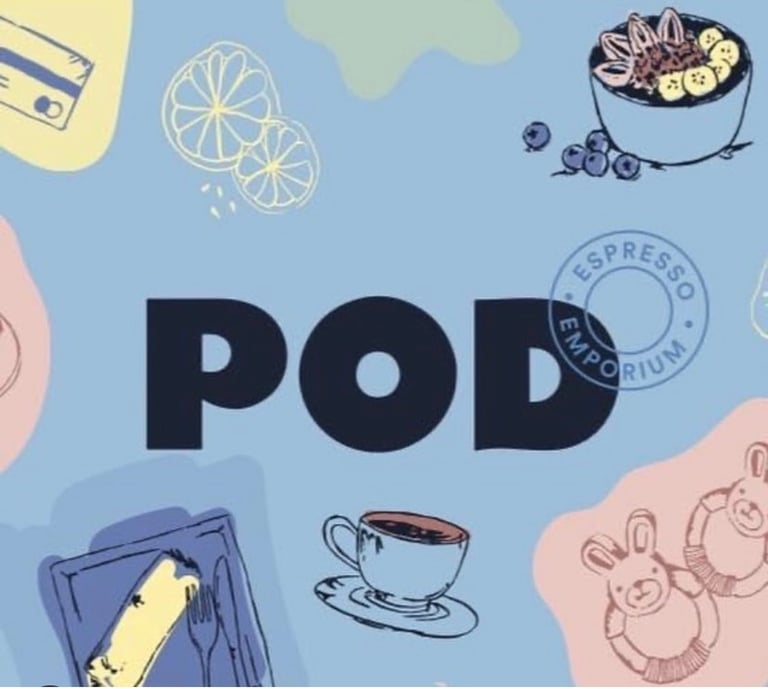

BEFORE
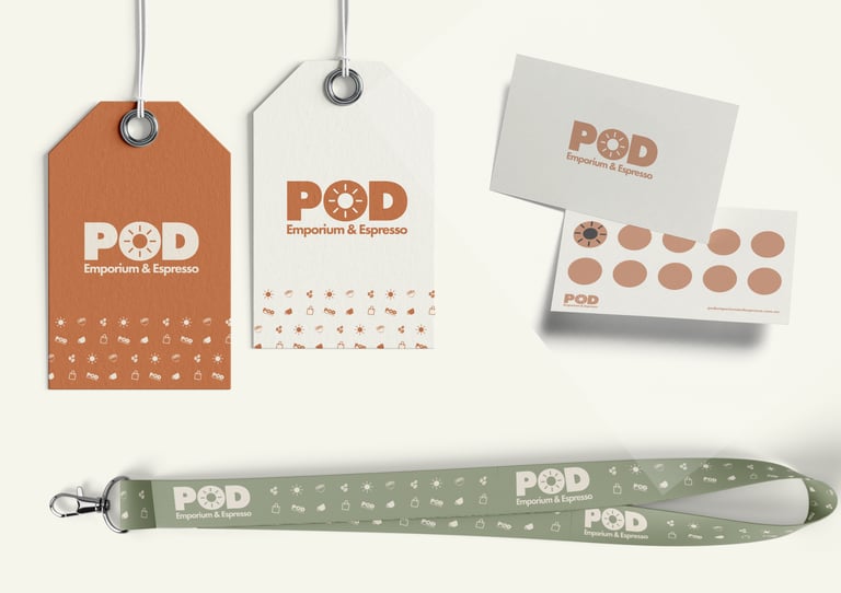
AFTER


THE CAFE REBRAND CHALLENGE
POD Emporium & Espresso is a cafe in Wollongong with an existing local presence and a customer base that already recognised the business. The goal of the rebrand was not to completely reinvent the cafe, but to refresh the identity so it felt warmer, more consistent and more commercially polished.
The challenge was to evolve the visual direction without losing the familiarity, personality and local character that customers already associated with POD.
For a cafe, branding needs to do more than look good on a logo. It needs to work across signage, menus, social media, printed material and the everyday in store customer experience.
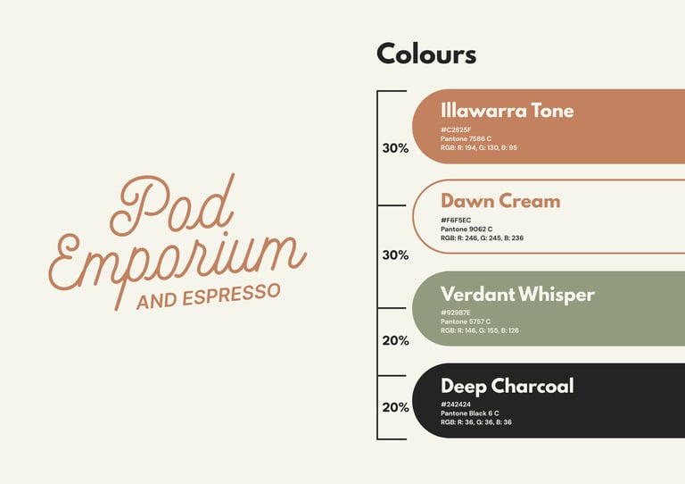
A VISUAL IDENTITY TIED TO THE ILLAWARRA LAND
The refreshed identity was built around warmth, familiarity and a stronger connection to place. Rather than creating a generic cafe brand, the direction drew from Wollongong and the wider Illawarra region, including the natural landscape and local character of the area.
The main colour direction was influenced by the rich red tones associated with the Illawarra cow, connecting the identity back to the region in a subtle but meaningful way. This gave POD a warmer and more grounded visual language, helping the rebrand feel considered rather than surface level.
The result was a refreshed brand system that felt more polished, more memorable and easier to apply, while still keeping the charm and recognition of the existing cafe.
BEFORE, AFTER AND BRAND APPLICATIONS
The before and after comparison shows how the POD Emporium & Espresso rebrand moved the cafe from an existing local identity into a warmer, more consistent and commercially polished brand direction.
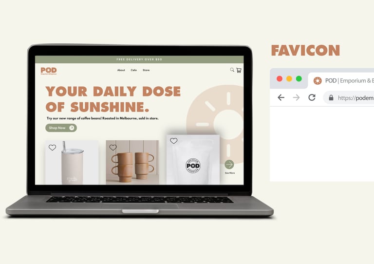
The refreshed identity was designed to work across real customer facing touchpoints, including signage, menus, social media, printed collateral and general cafe communication. This helped create a clearer and more cohesive visual experience wherever customers interacted with the brand.
The outcome was not just a better looking cafe brand. It was a stronger visual foundation that helped POD feel more recognisable, more intentional and more aligned with its Wollongong setting.


Copyright © 2026 Maljers Creative. All right reserved. ABN: 75 227 845 396


Based on the Central Coast, NSW, Maljers Creative works with health businesses, allied health clinics, professional service providers plus local businesses across Gosford, Erina, Tuggerah, Wyong, Terrigal, Woy Woy, The Entrance, Berkeley Vale plus surrounding Central Coast areas.
Maljers Creative acknowledges that while our work reaches businesses across Australia, it is created on the lands of the Darkinjung people.
We pay our respect to Elders past plus present, honouring the enduring craftsmanship, creativity plus storytelling traditions of this Country.