
THE CHALLENGE
The client was launching a new physical rehabilitation business that needed to feel trustworthy straight away. In this space, presentation matters because the brand may be seen by workers, employers, doctors, insurers, referrers plus other professional stakeholders.
The challenge was to create something that felt serious enough for the rehabilitation industry, but still approachable enough for people navigating injury, recovery or return to work support.
It needed to avoid the common trap of looking too medical, too sterile or too generic.
THE BRAND IDENTITY
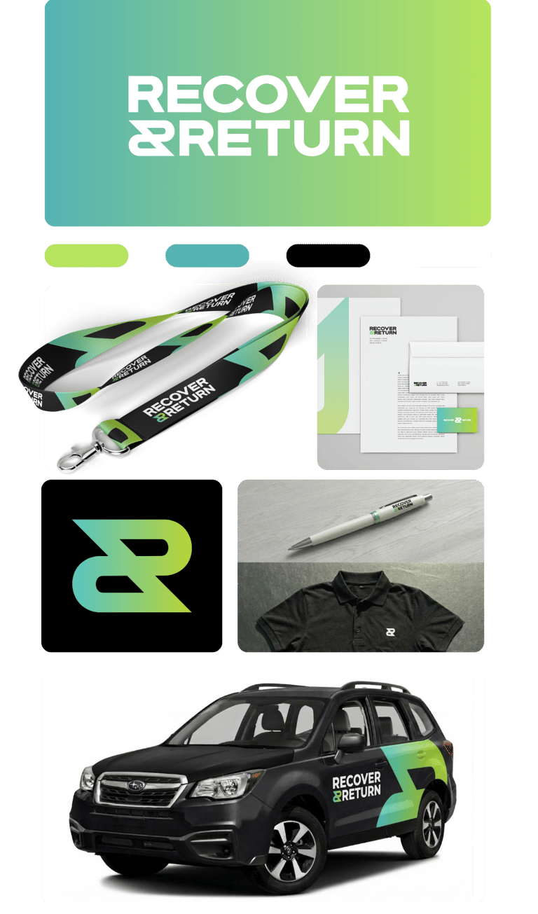
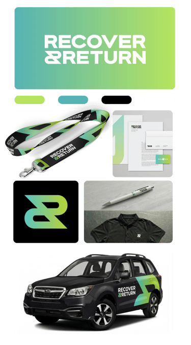
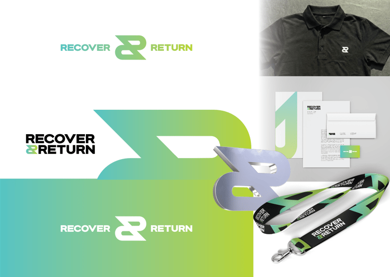
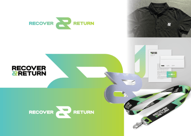
The Recover & Return identity was built to feel clear, strong plus memorable.
The visual system uses bold typography, a fresh colour palette plus a clean layout style that helps the business stand apart from traditional rehabilitation brands.
The goal was not to make the business look like a hospital, clinic or generic health provider. The goal was to create a brand that could sit confidently in the rehabilitation space while still feeling distinct, modern plus easy to recognise.
This gave the client a brand foundation they could build on across digital, print plus professional referral touchpoints.
THE WEBSITE
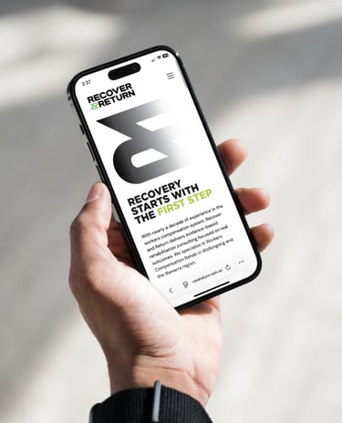
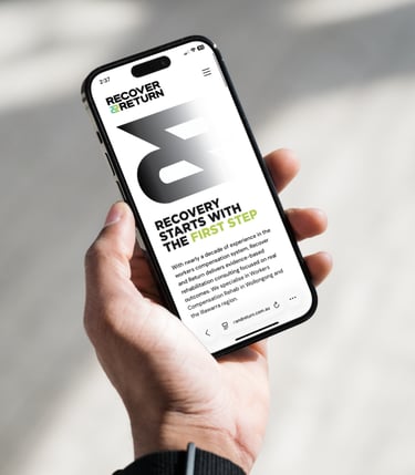
The website was designed to give Recover & Return a clear online presence from launch.
The structure needed to explain what the business does, who it helps plus why the service matters without overwhelming visitors with too much clinical language.
The website focused on clarity, credibility plus ease of understanding. It gave the business a professional destination that could support referrals, enquiries plus future search visibility.
THE OUTCOME
Recover & Return launched with a complete brand presence rather than a scattered collection of separate assets.
The business had a visual identity, website, referral material plus a clearer way to present itself to the market.
Maljers Creative helped turn the original idea into a professional physical rehabilitation brand that looked credible, felt considered plus gave the client the tools needed to start building trust from day one.


Copyright © 2026 Maljers Creative. All right reserved. ABN: 75 227 845 396


Based in Wollongong, Maljers Creative works with health businesses, allied health clinics, professional service providers plus local businesses across the Illawarra Region in NSW.
Maljers Creative acknowledges that while our work reaches businesses across Australia, it is created on the lands of the Illawarra people.
We pay our respect to Elders past plus present, honouring the enduring craftsmanship, creativity plus storytelling traditions of this Country.